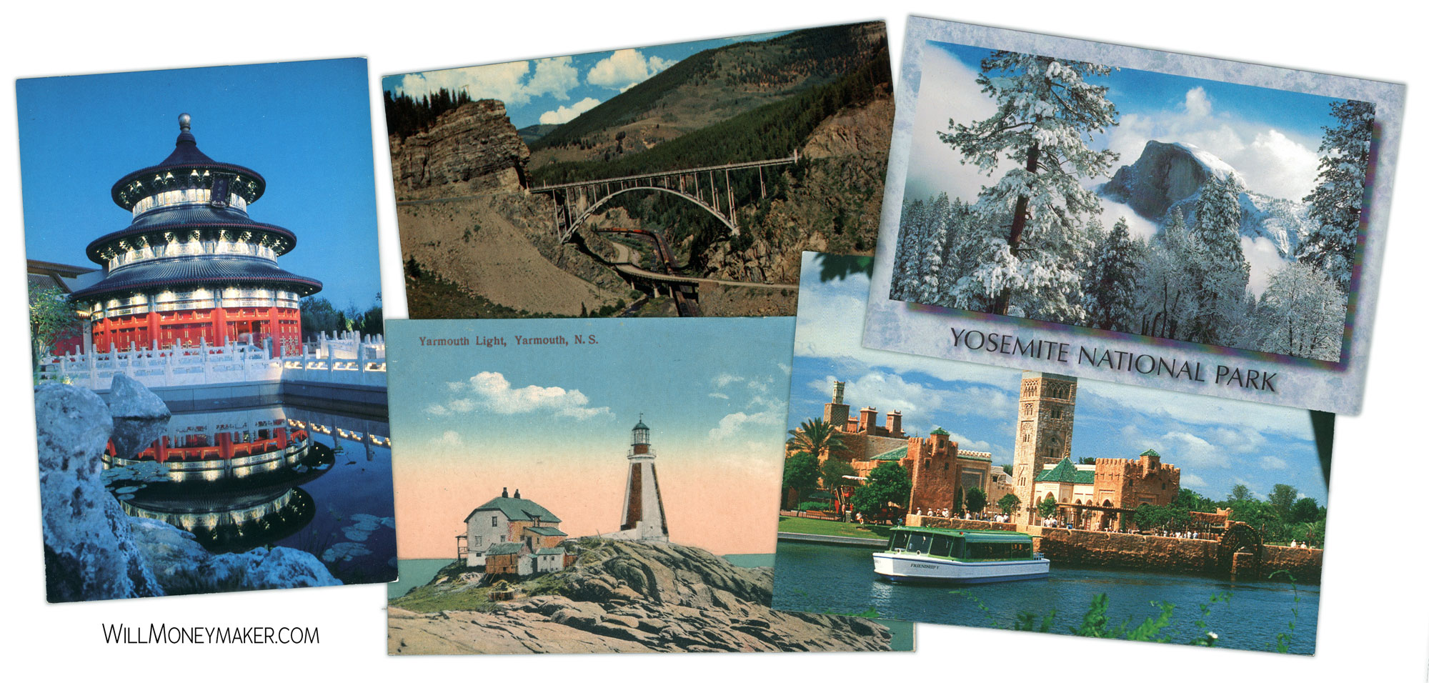
The biggest part of photography is coming up with new kinds of art, right? To do that, we take our inspiration from all kinds of places. Namely, the conventional art world combined with the things that inspire us as we go about our lives—but there are some other unconventional sources in which we can look.
To that end, here’s an odd thought. What about the style of comics or the Japanese version of comics, which is referred to as “manga”? Among literature, these are niches that many of us may not delve into—though I’m sure some of us do. And I’m not saying that we should run out and start reading comics. I think we’re all familiar enough with the general layout of the average comic to get what I am referring to.
And what I am referring to is how comics are typically laid out. In old fashioned comics, often the panels were placed in some sort of grid, even if it was an asymmetrical grid, which can work, and in modern comics, you often see pages where panels are overlapped.
I think this type of formatting can be a great new way for photographers to display art while telling a story. One thought that comes to mind is photo albums. In fact, I can see a lot of similarities between photo albums and comics. They follow a very similar sort of style, really. Photo albums have a time progression, with the story unfolding in chronological order. Most of them do tell some sort of story, especially when you see the pictures from the wedding, then the honeymoon, then the baby pictures, followed by shots of the family growing up.
The main difference? Photo albums are typically formatted more like old fashioned comics, or newspaper comic strips, with images spaced out in a grid, often spaced quite far apart, rather than featuring the more modern overlapping panel style.
Whatever style you choose, I think this can work wonders as a storytelling tool. Of course, the more common photo album style already features prominently in many photography books—and that’s why I’m advocating for experimentation with new types of spreads. Try overlapping images on one page, and arranging them in a logical left-to-right progression that leads viewers through an action-packed page. Then on the next page, follow a more traditional format to give viewers a little break. Intersperse pages that are devoted to a single large image when that image really calls for attention—just like how comics use a full page spread or even two-page spread to depict the height of the action.
Keep it all in chronological order and tell a cohesive story from start to finish. Make sure there is enough variance between pages so that people can feel the ebb and flow of the story you’re telling—lots of smaller images when the action is fast, fewer, larger images when viewers are meant to linger in a particular place. Ultimately, whether you choose to go with a more graphic comic book style or whether you opt for a more traditional photo book layout, I still think it’s valuable to think of it like you are putting together a comic book. Why? Because that helps you to think of it more as a story, start to finish, and less like a series of related images. When you’re in that storytelling frame of mind, that’s when projects come together to create something meaningful.

