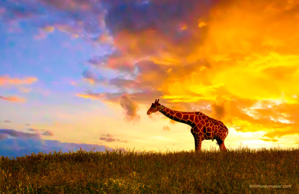
Does color get all the attention that it deserves? Sometimes I think not—and that’s because when you really dive into the world of color and the science behind it, there’s a lot more under the surface than initially meets the eye. Often, we approach color in terms of saturation, contrasts, or the general tone of the image. We might rely on cool colors to create a more remote look or warm tones to create a reminiscent sunny afternoon feeling.
But these are just small parts of a whole, to my mind. I think that we can use color to tell a story—or to at least provide a lot of context that might be missing without careful attention to the shades that we use.
Let’s think for a moment about color theory, and specifically, the meanings associated with certain colors. Red, for example, is associated with things like fire and violence in some contexts. In others, it is associated with love and passion. Green is noted as a calming color that represents growth, new beginnings and abundance. Sometimes it can represent jealousy, and sometimes, it represents inexperience kind of like the term “greenhorn” suggests. Blue is another calming, soothing color, though usually among the lighter shades on the spectrum. Bright blues are seen as energizing and refreshing, and dark blue is seen as a reliable color. Blues in general can represent sadness.
As you can see, for every shade, there is a meaning or association—and those meanings can differ depending on the lightness or darkness of the shade. So how can we account for colorful elements within a photograph? I think we can look for ways to make them work together to tell a story, particularly now that we have digital editing tools at our fingertips, which makes it much easier to manipulate colors in a variety of ways.
Let’s say, for example, that you’re documenting a laborer in some sort of unforgiving job. First, you would approach the composition—showing the laborer bent over their task in a way that makes people consider both the task itself and the uncomfortable posture. You’d also want to add in textural elements such as the materials that the laborer is working with, or the texture of grime on their hands if it’s a dirty job. These are all pieces helping you to tell the story of the laborer’s arduous task.
Next comes color. Can you use colors to tell more of the story? Perhaps some steely grays to add elements of hardness and difficulty. Spots of yellow, orange and red could be useful to add another layer since these colors are commonly associated with caution and danger. In fact, in this imaginary scenario, there is likely a caution sign in these colors nearby that you can work into the composition with careful positioning.
Then you have the overtones to think about. Cool tones can be worked in to make the scene feel more forbidding. Warm tones can give you a reminiscent look—but with all the story elements already in place, the context changes from a happy reminiscence to something different, like looking back on yesteryear and how much more difficult certain jobs were before technology changed the way they were done. Of course, this is all an imaginary example, but one that I think provides some ways in which color can be used not so much as decoration or an enhancement, but as a strong storytelling element in its own right. All we need to do is give color the same weight that we give to compositional elements.

