
There is so much to consider each and every time you take a photograph: Lighting, composure, the subject material, colors and more. Tone is another thing to consider, an aspect of photography that isn’t as commonly discussed as other, more popular topics.
Yet, tone is incredibly powerful. It is a large part of what sets the mood of the final image. And, there are all kinds of ways to achieve the perfect tones in your images. Use lighting of different color temperatures, or off-camera lighting with colored filters. Use your editing software to change or deepen the tone of the image. In film photography, famous films such as Kodachrome were known for their uniquely beautiful tones.
No matter how you choose to tone your photographs, it is important to understand what those tones will add. Here, I will discuss tones for both color and black and white photography so that you understand how to choose the right tones for your images.
 Tones in Color Photography
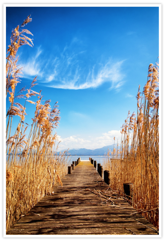
In black and white photography, the tones are a lot more obvious since it changes the photo to sepia and white or another color and white. However, that doesn’t make the toning of color photography, even though it is subtler, any less powerful. With color photography, it all comes down to enhancing the mood and meaning of the image.
As you’re thinking about tones, start with warm and cool colors, and think about their properties. Warm colors — reds, yellows, oranges and browns — can lend a variety of different feelings to an image, ranging between excitement and welcoming warmth. Cool colors, like green, blue and violet, on the other hand, tend to be more relaxing and refreshing, although blue can be used to indicate sadness.
Color tones can be broken down even deeper than that, however. As you are choosing a tone, it helps to think about the psychology behind colors — in other words, how colors affect people. Here is a quick list of the meaning of various colors to help you choose the perfect tone:
- Red is a rare color to use as a cast in a color image, but it has been done before. In general, red has warmth and energy to it, and it can also be used to convey a sense of strength or danger. When you see a red color cast, most often, it will be a shade that trends towards brown.
- Orange tones make people think of comfort — good food, warmth and a sense of security.
- Yellow is a commonly used tone, and in fact, it is the tone that you’ll get when you take photographs as the sun is getting ready to set for the day — that rich, golden color that makes everything seem more cheerful.
- Green is the color of harmony. It tends to make people feel refreshed, so when you add a green cast to an image, make sure that the subject material matches the fresh and tranquil tone you’ve chosen.
- Blue is likely the most versatile color. Depending on your subject material, it can indicate serenity or tranquility. Because it is such a chilly color, however, it can also lend a depressing sort of feeling to your images.
- Violet tends to make images feel more authentic, and with certain subject material, the image may see more upscale or luxurious. In fact, in monochrome photography, this hue is popular since it conveys a sense of grandeur or motion.
Be aware that shifts in shade mean a lot, too. For instance, a red that trends toward brown, a completely brownish cast, or a yellow-green color can all give the image a completely different feeling than their parent colors will. Experiment in post processing with various shades, and you’ll quickly see what I mean.
Tones in Black and White Photography
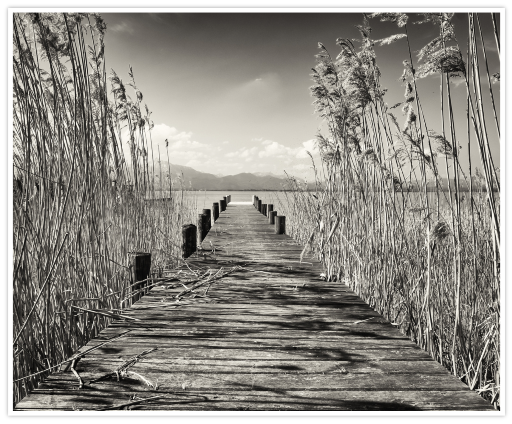
As I mentioned before, when it comes to tones in monochrome photography, they tend to be a lot more obvious. There are also three ways to add tones to your monochrome images: Add the color to the lightest areas of the photograph, keeping your blacks black, change the color of the blacks and middle tones while leaving the highlights alone, or tone all of the colors across the range.
When it comes to colors, there are several popular options. For instance, sepia is used to soften the image, or to make the image resemble an old-fashioned photograph. If you browse sepia photos, you’ll notice that some trend more towards black, with brownish highlights, while others are sepia all the way through. Here are some other popular ways to tone monochrome images:
- Selenium, which is a blue to purple tone that adds a lot of drama to a monochrome image.
- Gold toning, which has an orange-red effect, with blacks that are actually blue.
- For a vivid blue, try cyanotypes, which replicate the old process of photographs on glass plates.
Of course, when it comes to monochrome or even two-tone images, you aren’t limited to these options. Use any hue that you desire — but make sure to reference the colors I’ve listed in the color photography section so that you can get an idea how those colors will affect the final image.
A Note on Subtlety
The biggest issue with toning is its overuse. The temptation is there to create blazingly bright images, and with certain toning techniques, such as cyanotypes, this may not be the right path to choose. However, other times, a subtle tint is all you need to influence the image. In general, when it comes to toning, less is usually more.
With every image that you create, don’t hesitate to tinker with the tones. You’ll be amazed to find that slight adjustments make a huge difference. And, since most of us aren’t attempting to apply tones using obscure and old-fashioned processes anymore, you’ll be able to experiment endlessly to learn what works best for each individual image.