Brevity in seems like an odd concept to apply to photography. All in all, the art itself is self-contained, all of the information, all of the magic, everything happening within the confines of one frame. So where do you have the opportunity to be brief?
Actually, there are several areas in which things can be trimmed back, not just within the frame but within the process as a whole. Certainly, the creative process is not something that should be brief. The creation of art, it is a process that takes hours of thought, thorough editing, much time devoted to revisiting the subject material and seeing what you can improve upon.
The learning process is not a short one, either. I always say that as a photographer, you’ll never stop learning. There are always new skills, new techniques, new pieces of gear, even new artistic methods to learn. A lifelong process in every sense of the word.
But there are a few areas in which brevity is appreciated or even required. I’ll show you some examples so that you can see what I mean.
Abridging Your Composition
Brevity can be important when it comes to the composition of your images. When I speak of abridging your compositions, I’m talking about removing the clutter. In general, the less clutter you have, the better off you will be. This truly is one of those “less is more” situations.
You see, in cutting out some of the chaff, you expose the true meaning of the image. But where do you start? How do you go about cleaning up clutter?
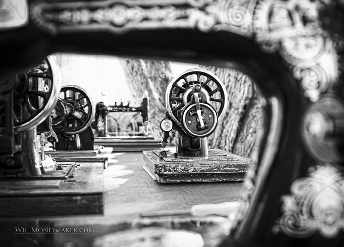
It all starts by identifying the main subject of the image. This element, be it a person or something else, obviously must be present. Next, you’ll need to isolate the things in that image that support the subject. So, if you are taking a photograph of a woman working on a sewing machine, supporting elements would include the sewing machine itself and perhaps the project that she is currently working on.
And all the rest? What about the box of sewing supplies sitting next to her elbow? The pile of fabric in the corner of the room? Décor items that creep in around the edges of the frame. These are all things that don’t necessarily support the subject or the story you are trying to tell about the subject. In other words, these things might very well be clutter, distractions that cloud your viewers’ eyes, making it harder to see the subject for who she is and what she is really doing. Cut these elements by cropping, by changing angles until distracting elements are no longer within the frame — whatever method you need to use.
One trick that may help with this is to set up your shot, look through the viewfinder at the future photograph, then close your eyes. List off the elements that you remember off the top of your head. Then look through the viewfinder again and take note of all the elements that you did not remember to put on your mental list. If you couldn’t remember it, chances are, it doesn’t need to be included in your final image.
Keeping Your Body of Work Brief
Brevity is also something that should be considered when you are creating a body of work. Of course, I’m not speaking of your entire body of work, your entire collection of images that spans a lifetime of art-making. I am referring to smaller things, like a portfolio, a website, any collection of images that are meant to be displayed for the benefit of others.
You wouldn’t, for example, go to a gallery owner with an iPad that is loaded with 200 photos. That is a lot to expect that one person could look at and evaluate each piece, all over the course of the half hour or hour that you spend with this person. Instead, create a smaller collection. Ten, fifteen images, perhaps a few more. Ensure that there are images that truly highlight who and what you are. Make it something that a person can reasonably look at in a shorter window of time.
The same is true online, after a fashion. Certainly, you can put lots and lots of images in online galleries. However, if you don’t have some system for compartmentalizing, most of these images will be overlooked. When you create online galleries, sort images into smaller themes or subcategories so that people can look at and enjoy smaller groupings instead of expecting them to digest the hundreds of photos you’ve uploaded — or simply upload fewer images in general if all you need to do is create a brief showcase of your work.
Brevity of Scope
Sometimes, the size of the projects that we take on is problematic. I’ve heard people say, “I want to capture what it is that makes Ohio great in a series of photographs.” And whenever I hear something like this, I stop and think. Now, wait a minute! Ohio is a huge place. Is the scope of such a project a bit large? Can you truly encompass something so large in a collection of images?
Probably. But, that collection of images will either be huge, or it will have vast voids in it. Ohio, for instance, is a very diverse state. It has mountainous terrain and prairie, swamp and forest. It features all kinds of cultures, from Amish Country to industrial farmers to coal miners to major cities. Each city, from Cleveland to Columbus to Cincinnati, has its own personality. The list goes on and on.
And that is why I think it helps to consider abbreviating the scope of some projects. Instead of encapsulating something so large, something like a state, perhaps break it down into several smaller projects. Rather than covering all of Ohio, document one region, one city, one county. Consider something smaller that lets you delve deep into the subject material, allowing you to create a body of work that is short enough to be reasonably enjoyed but detailed enough to tell the whole of the story — without requiring a 1000-photograph portfolio to capture it all.
It’s a strange thing to say, but brevity really can be a beautiful thing. More than that, if you are actively looking for ways to streamline, to simplify, you’ll find that there is more room for the things that really make photography shine: creativity, thoughtfulness and good storytelling.

