What makes a black and white image effective? In my opinion, it takes more to create an effective black and white image than it does to create an effective color image. By removing the color, you are taking away one of the major elements, quite possibly the element that is most distracting or that takes away from all of the other parts of the image. This leaves you with things like composition, tonal range, shape and texture to rely on — all important parts of an image that sometimes just aren’t as noticeable when objects within the frame are brightly colored.
Let’s dig into the nuts and bolts of black and white photography, and by the end, you’ll have a better understanding of what makes an image effective.

Understanding the Zone System
This is a system that was pioneered by Ansel Adams and Fred Archer, and even if you don’t use it actively, understanding how it works will give you some insights into black and white imagery. In other words, learning about the Zone System will help you to see, as you create the images, where the light and dark spots will be.
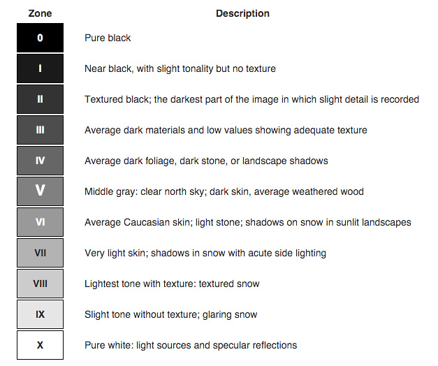
In a nutshell, the Zone System breaks an image down into 11 different shades (numbered from Zone 0, which is black, to Zone 10, which is white) along the white to black tonal scale. Middle gray, which is the tone that is exactly between white and black, is Zone 5. For the most part, the thinking is that in order to have a correctly exposed black and white image with a broad tonal range, the lightest parts of the image should fall around Zone 7 while the darkest parts should be right around Zone 3. Anything past these ranges, and you’ll start to lose texture and detail.
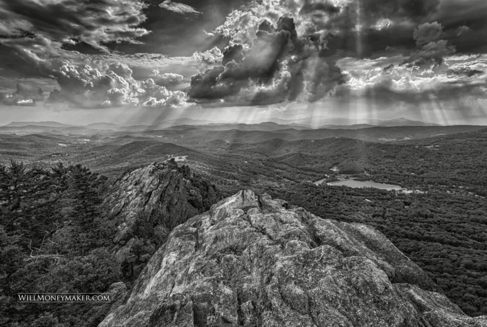
Now, you don’t necessarily have to adhere strictly to the Zone System as you create black and white images. My point in explaining this was to illustrate the spectrum of shades between black and white — and how necessary it is to include a wide tonal range in order to create an effective monochrome image. You could take a photo that is mostly black and shades of dark gray, or you could take a photo that is at the lighter end of the Zone System, but the most effective black and white images generally make use of shades that span the entire spectrum, from white or light gray to black. Pay attention to the tonal range as you create your monochrome images and you’ll end up with visually diverse images and striking contrasts.

Without Color, What is the Point?
Once you have removed the color from an image, what value remains? Many people simply enjoy the contrasts or the play between black and white and all of the shades in between. But I would argue that the value of black and white imagery goes far deeper than that.
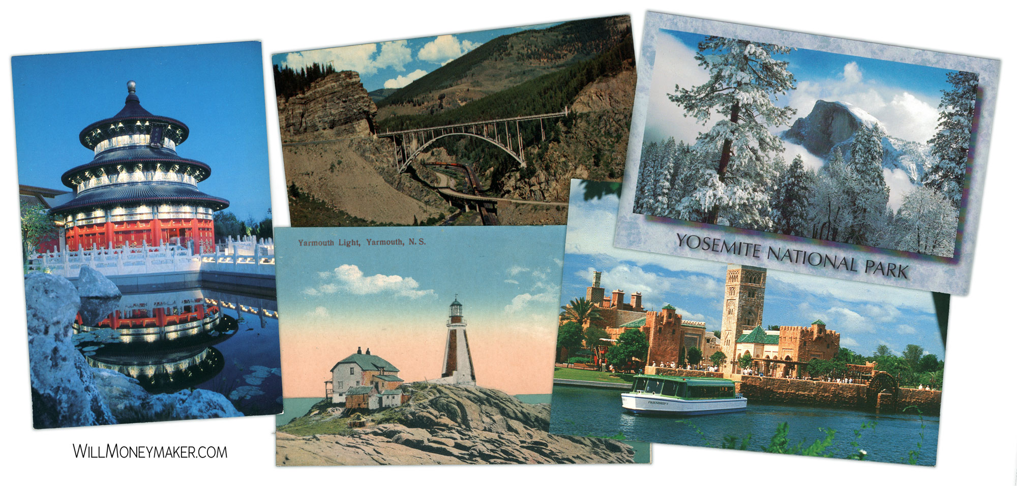
As I mentioned, when you strip away the color, you are removing a distraction. Now, instead of looking at the difference between red stones and the blue sky, or the shades of green in a leaf, you are forced to look for something more. That something more, if present, is what helps to make the image more effective.
If you intend to create black and white images, then here are some of the major elements you could work with in order to make the finished image visually interesting:
- Texture: Black and white is almost the ideal medium to display texture because, without the play of colors to distract you, you must now focus on the shades of gray and the details that create the texture. Rough stone, the texture of rope or twine, tree bark — rough textures tend to stand out in black and white images, and they also make interesting contrasts when paired with smooth textures.
- Contrast: Contrast is probably the most obvious element to toy with, and there is a lot that you can do with contrasts between dark and light. The most effective images that utilize contrasts don’t necessarily leave out the middle shades of gray, but the middle shades may not be as evident. Additionally, a good, high-contrast image doesn’t mean that you should lose detail in bright whites or dark blacks. As you experiment with contrasts, make sure to expose for both dark and light ends of the spectrum.
- Shape: Geometric designs are always fun when you are creating black and white images, but you aren’t limited to these alone. Take, for instance, a photograph of a flower. Remove the color, and what is left for you to look at? The shape of the petals, the sweep of the stem, the flower's profile, the leaves and so forth. Removing color is a great way to draw attention to shapes and shapes within shapes that may have otherwise been overlooked.
- Composition: Composition should be strong in any image, but more so in black and white. A little compositional mistake here or there can be forgiven in images that make use of beautiful colors because a large part of the intention of such an image is to enjoy those colors. In monochrome images, you only have shades, not hues, to enjoy — composition, and any flaws therein will be much more evident.

Perhaps this is why there is still such a mystique surrounding black and white images. I’ve heard it argued before that color photography is easy compared to monochrome. No photography is easy, in my opinion, not even color photography. If it were, all art would have already been made. However, I do think that black and white photography requires you to pay stricter attention to all of the details.


